
Built for a Founder in Motion
Case Study: Nathaniel Houghton, B2B Growth Advisor

Client: Nathaniel Houghton
Services: Brand Identity, Logo Design, Web Design, Photo Editing, Print Collateral Design
Platform: Squarespace
Timeline: 7 days
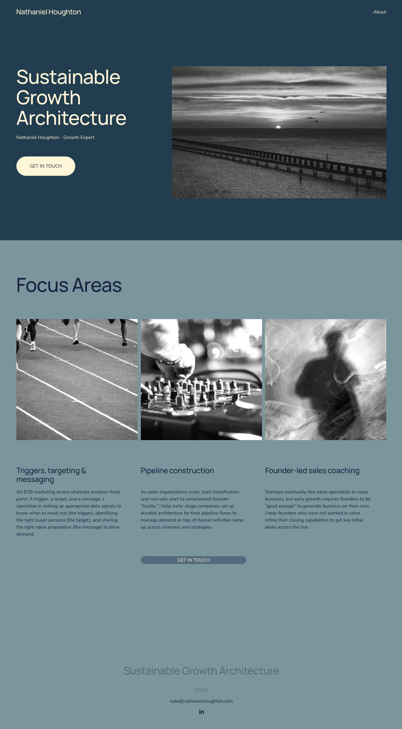
The original site. Generic palette, disconnected imagery, and positioning too vague to reach the right audience.
The Situation
Nathaniel Houghton is a B2B growth advisor with a real track record. He co-founded Incendium, a growth studio that made the Inc 5000 list. He built the Congo Leadership Initiative, which has trained over 10,000 young leaders since 2010. He holds degrees from Cornell and Harvard Business School.
When he came to us, he was navigating a professional transition and needed to move fast. He had consulting work to pursue and a network to activate, but not a website that looked the part.
His existing site was built on Squarespace with a blue heavy color palette that blended into every other generic consulting site on the internet. There was no logo or visual identity, and the site did not communicate the weight of his experience or the specificity of what he offers.
As David Ogilvy put it, a brand is the intangible sum of a product's attributes. For a consultant, that brand lives on their website. For Nate, the site needed to do the talking while he was out making calls. That is exactly the kind of problem JAM solves.
Why Personal Branding Matters More Than Most Consultants Realize
Consultants often underestimate how much their digital presence shapes first impressions. A prospect who gets a referral will look you up before they reply to your email. What they find either confirms the referral or creates doubt.
According to the 2024 Edelman LinkedIn B2B Thought Leadership Impact Report, 73% of decision-makers say that thought leadership content is a more trustworthy indicator of a company's capabilities than traditional marketing materials. For a solo consultant, that extends directly to their website.
Research from 2025 shows that executives with strong personal brands see 3 to 7 times higher conversion rates compared to traditional corporate marketing approaches. A well-built personal site is not a vanity project. It is a sales tool. You can see how JAM approaches that in our other case studies.
The Problem with the Original Site
The existing Squarespace site was functional but forgettable. The blue palette was the kind of safe, inoffensive choice that communicates nothing, and there was no logo or monogram for a prospect to anchor to.
More critically, the site did not reflect Nate's actual positioning. He works with early-stage B2B software and services businesses with a sales-led growth motion. That is a specific, valuable niche. The site said nothing about it.
A consultant navigating a transition cannot afford a website that raises questions instead of answering them.

The finished site. Dark, editorial, and built around a specific audience.
The Approach
We came in with a clear point of view on what the site needed to do: project authority, communicate specificity, and make it easy for the right prospect to say yes. See the full range of our services for context on how this fits into a typical engagement.
Rejecting the Original Colors
The blue palette went immediately. It was not bold enough to stand out and not specific enough to mean anything. We chose a dark, editorial direction instead. Deep charcoals, warm terracotta accents, and a high contrast layout that reads as serious without being cold.
The decision was ours, made with Nate's trust. He did not bring a brand direction. He brought a problem to solve. That kind of open brief is where good design happens.
Building the Identity from Scratch
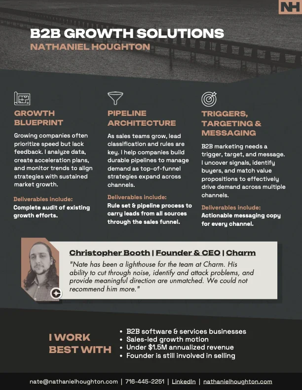
Nate had no logo, so we designed the NH monogram, a clean bold mark that works at any size and carries across every touchpoint including the website, the one-pager, and the print documents. According to Nielsen Norman Group, consistent experiences across touchpoints build trust and credibility with users. A good monogram does not need explanation. It just needs to show up consistently.
Old branding versus new. The shift from generic to authoritative in one visual.
Working the Photography
Nate had a strong hero image already, a dramatic pier photograph that turned out to be the right choice for reasons beyond aesthetics. A pier is a place of departure. Boats set off from it toward open water, toward opportunity, toward the unknown. But uncertainty is always on the horizon. That tension is exactly what Nate's work addresses. He helps early-stage companies move forward with a plan instead of guessing. The image says that without a word of copy.

The original photo, that we regraded and treated to match the new visual identity.
Instead of discarding it, the image was color graded, resized to full width, and treated with added grain and contrast to match the tone of the new design. The result is a hero section that stops a scroll and sets the right tone before a visitor reads a single line.
Listening on the Icons
The original icon choices for the three service areas did not land with Nate. He pushed back, not because he wanted different shapes, but because he had a clearer understanding of how his services should be positioned than the initial selection reflected. We listened, iterated, and the final icons better represent the specificity of what he actually delivers.
That kind of feedback loop is not a problem. It is how good work gets made.
Beyond the Website
The project did not stop at the website. We designed two print-ready documents and templates for further use with Nate's content and the new visual system: a services one-pager and a recommended growth cadence document. Both take dense, text-heavy content and turn it into something a prospect can actually read and remember. The visual language carries across both, which is what a real brand system does.

The Results
The site launched in 7 days. Shortly after, Nate secured a senior Head of Americas Sales role.
We will not over claim credit for that outcome. Nate's track record and network did the work. What the site did was make sure that when anyone looked him up, what they found matched the quality of the person they were considering. It removed doubt. That matters.
7 days from brief to live site, 3 deliverables including website, one-pager, and content document, and 1 identity built from nothing, designed to last.
What This Project Shows
The best personal brand websites are precise, making the right impression on the specific person you are trying to reach.
Nate's site works because it does not try to appeal to everyone. It is direct about who he works with, what he delivers, and why it matters. That specificity is a design decision as much as a copy decision.
The 2024 Edelman LinkedIn report also found that more than 75% of decision-makers say a piece of thought leadership content led them to research a product or service they were not previously considering.
A well-positioned personal site is exactly that kind of asset. If you are ready to build one, get in touch.
FAQ
What does a personal brand website for consultants actually need?
At minimum: a clear statement of who you work with, what you do for them, and how to get in touch. Most consultant sites fail at the first two. If a prospect cannot identify themselves in your positioning within ten seconds, they move on. JAM's services are built around solving exactly that.
How long does it take to build a personal brand website?
With a focused brief and a client who can make decisions, a well-built personal site takes 5 to 10 business days. Longer timelines almost always come from unclear positioning, not from the design work itself.
Do I need a logo before building my website?
No, but it helps. A logo gives the site a visual anchor and makes every other design decision easier. If you do not have one, building it alongside the site is the most efficient approach. They should be designed together anyway.
Should consultants use Squarespace or a custom build?
Squarespace is the right choice for consultants who need a clean, professional site without ongoing technical maintenance. For more complex requirements, tools like Webflow or Wix offer greater flexibility. The right platform depends on the scope of the project.
What is the difference between a personal brand website and a portfolio site?
A portfolio site shows past work. A personal brand site makes a case for why someone should work with you now. For consultants, the distinction matters. You are not showing a body of work. You are positioning yourself as the right choice for a specific type of client with a specific type of problem.
Ready to build something that works? Contact us!