
How Jamwise Works: A Case Study in Constraint-Driven Design
Client: JAMworks (internal project)
Services: Design & Brand, Front-End Development, AI & Automation
Platform/Tools: Squarespace 7.1, Vanilla CSS, Vanilla JavaScript
Timeline: Ongoing
The Situation
Every studio website has to do three things at once: introduce the brand, communicate what the work actually is, and make clear that the people behind it know what they are doing. Most sites spread that across five pages and a lengthy scroll. We wanted to land all three in the first thing a visitor sees.
The hero is that moment. It is the opening frame, the first sample of judgment a prospective client encounters. So we treated it as the most important design problem on the site rather than a container for a headline and a button.
The idea for how to do it had been waiting for the right tools for years. When AI-assisted development made it practical to execute, we built it. The one constraint that shaped every decision along the way was that the whole thing had to live inside a Squarespace code block.
The Hero Matters More Than You Think
Malcolm Gladwell writes about the trap of misreading disadvantage. "We have a definition in our heads of what an advantage is and the definition isn't right," he argues in David and Goliath. "It means that we underestimate how much freedom there can be in what looks like a disadvantage." A platform with limits forces decisions that a blank canvas lets you defer indefinitely. That deferral is rarely good for the work.
The numbers behind why the hero matters are not subtle. Users form an opinion about a website in just 50 milliseconds, according toresearch published in Behaviour and Information Technology. That opinion is not about whether the site is useful or trustworthy. It is a gut read on whether it deserves attention at all.94% of first impressions are design-related, and75% of visitors judge a company's credibility based on website design alone, according to the Stanford Web Credibility Research program.
For a studio like ours that gap matters. We are not selling a physical product or a software subscription. We are selling judgment, and the site is where that judgment gets evaluated first. You havesomewhere between 0.2 and 2.6 seconds before a visitor has already decided whether to keep going.
Nielsen Norman Group research shows that users spend 57% of their page-viewing time above the fold. Content below that line still gets read when the hero earns the scroll, but it never gets the chance otherwise. Eye-tracking data from the same study found that the 100 pixels above the fold received 102% more attention than the content immediately below it.
The hero is structural. Every other section of the page depends on it.
Starting With the Logo
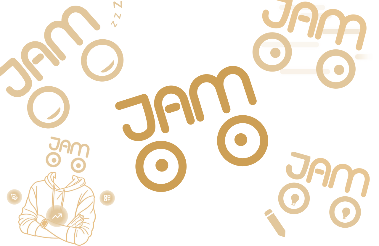
The mark that sparked the idea.
We created this logo in 2021, and for years, the eyes just stared back. The letterforms spell JAM in a style that reads as hair sitting above two large circular eyes, so the whole mark resolves as a face. It works at any size, reads in a single glance, and carries a personality that most wordmarks do not.
From the moment the mark was finished, the intention was for the eyes to follow the cursor. A logo built as a face should behave like one. Building it always lingered in our minds, but hiring a developer to make it happen was not in the budget.
The Pure CSS Experiment
The first build used no JavaScript. We mapped a 7x7 invisible hover grid over the logo, with each cell corresponding to a pupil position. When the cursor entered a cell, the pupils shifted toward it using CSS selector logic alone. No event listeners. Just specificity and the cascade doing something they were never designed to do.
In a controlled environment it worked. The pupils tracked, the logic held, and the effect read as intended. Then it went into Squarespace.
The platform's rendering environment introduced specificity conflicts that compounded rather than resolved. Hover grid cells lost their stacking context under certain conditions. Fixing one edge case surfaced another. CSS selector-driven interaction depends on a clean, predictable DOM, and Squarespace's template layer does not provide one.
What this phase produced was a precise understanding of where the CSS approach broke down and exactly what would be needed to fix it. A diagnosis which made the next decision straightforward.

The CSS detection grid that drives the eyes following the user’s pointer.
Opening the Door to JavaScript
We turned to JavaScript to expand on what we made with CSS. The eye tracking still runs on CSS and JavaScript handles the cases that CSS structurally cannot: click events, load state, time, and the kind of conditional awareness that the cascade has no concept of. CSS drives the visual state. JavaScript decides when and why it changes.
With that layer in place, the scope of what the hero could do expanded significantly. The wink on click. The service chooser that walks a visitor through a short decision sequence with a progress bar and staged button reveals. The Calendly embed that surfaces at the end of that flow. Each piece was built against the same constraint, on the same component, solving the same underlying problem. That shared origin is why they feel like one thing rather than a collection of features.
One principle came out of this phase clearly: reach for JavaScript when the behavior you need requires awareness that CSS does not have. When it does not, CSS is almost always the cleaner solution. Knowing where that line sits, and why, is what separates interaction work that holds up from work that accumulates workarounds.
The load sequence came out of a practical problem: a hero this interactive needs a moment to initialize, and a stutter on arrival ruins the first impression before it has started. Staging the entrance buys that time without the visitor ever knowing they are waiting.
Turning this into a site-wide motif
Building Jamwise created a template for what the mark could do across the site. Each page now has its own version: on the work page, a pencil writes while lightbulbs flash in the pupils. On the services page, speed lines blur the frame while the pupils swap out for arrows pointing up and to the right. The about page shows the mark surrounded by orbiting icons representing each of the three practices. The character became a visual system, with each variation doing the work of communicating what the page is about before a single word is read.
What We Learned
Building something for yourself is a different kind of work than building it for a client. There is no brief, no approval process, no one to defer to. Every decision belongs to you, and the feedback loop is immediate because you are the user. You see the result every time you open the site.
That compression accelerates learning in ways that client work rarely does. Iteration happens in hours. You can break something, understand exactly why, fix it, and ship before the day ends.
Three things stand out from the process of building this.
Constraint produces decisions. A blank canvas defers choices. Working inside Squarespace meant every part of the hero had to earn its place, with no custom layout engine or third-party component library to fall back on. The pure CSS experiment happened because we were pushing for a solution within a real limit. That push produced something we would not have found on an open canvas.
Knowing where to draw the line between CSS and JavaScript matters as much as knowing how to use either. That line determines how the code behaves over time, how readable it stays, and how gracefully it handles edge cases. Getting it right took iteration, and working through where it was wrong was how we learned where it actually belongs.
The platform is less important than the thinking brought to it. A Squarespace code block is not the obvious place to build an eye-tracking, animated, interactive hero component. The constraint did not limit the work. In most respects it sharpened it.
What This Project Shows
The hero exists to make a prospective client feel, in the first few seconds, that the people behind this studio think carefully and build deliberately. Whether a visitor ever knows the eye tracking runs on a CSS grid, that the load sequence is class-toggled from JavaScript, or that the whole thing lives inside a Squarespace code block is beside the point. What matters is the experience those decisions produce.
Good design work and good technical work are the same discipline applied to different problems. The logo, the animation, the interaction logic, and the load sequence are all expressions of the same thinking. They hold together because they were built by the same hands against the same standard.
If you are building a brand and want the work to reflect how seriously you take it, that is the conversation we are here to have.
See our services |See more work |Start a project
FAQ
What is a hero section and why does it matter? The hero is the first section of a web page, the part a visitor sees before they scroll. It is the most-viewed real estate on the page, the first test of credibility, and the primary driver of whether someone stays or leaves. Visual design quality determines that judgment within a fraction of a second, which makes the hero the highest-leverage part of any website to invest in.
Can you build custom interactions inside Squarespace? Yes, with real limitations. Squarespace code blocks accept HTML, CSS, and JavaScript, which makes most front-end interactions achievable in principle. The challenge is that the platform's rendering environment and template layer introduce specificity conflicts and DOM behaviors that require genuine front-end knowledge to navigate. Custom work inside Squarespace is possible, but it requires understanding both the development side and the platform's particular constraints.
What is the difference between CSS animation and JavaScript animation? CSS animation is declarative. You define a start state, an end state, and a duration, and the browser handles the transition. It is performant and clean for visual state changes. JavaScript animation is imperative. You write logic that runs over time, which gives you access to events, conditions, and sequencing that CSS cannot express. Most production interactions use both: CSS handles visual state and JavaScript handles the logic that decides when and why that state changes.
What is cursor-tracking eye animation in web design? It is a UI effect where a character's pupils follow the user's cursor position across the screen. The effect is achieved by mapping cursor coordinates to pupil position in real time, creating the impression that the character is watching the visitor move around the page. When it is tied to a logo or mascot with an existing personality, it adds a layer of presence that is difficult to achieve any other way.
How long does a hero section like this take to build? Longer than it looks and shorter than you might expect. This component was built iteratively across several weeks, with each phase informing the next. The CSS experiment, the JavaScript integration, the load sequence, and the service chooser were all developed and refined in stages. For a client project, scope depends on the level of interaction required and the platform it needs to live in.
Does a complex hero help with SEO? Not directly. Search engines index content, not interaction. What a well-built hero helps with is engagement: lower bounce rates, more time on page, and higher scroll depth. Those behavioral signals can influence how a page performs in search over time, but the primary case for investing in the hero is conversion, not ranking.
Ready to build something worth the first impression? Let’s chat